"The puzzle piece is so effective because it tells us something about autism: our children are handicapped by a puzzling condition; this isolates them from normal human contact and therefore they do not ‘fit in’. The suggestion of a weeping child is a reminder that autistic people do indeed suffer from their handicap."
But there was considerable controversy. The logo was criticized as demeaning; dehumanizing; the reduction of autistic individuals to their condition and little else.
I’m a 53-year-old autistic man. I was diagnosed only seven years ago. I never experienced anything resembling Applied Behavioral Analysis (ABA), often criticized for its behavioral modification of autistic traits in children. The DSM-IV criteria on autism did not appear until after I was finished with college. I wasn’t even aware of the puzzle piece (now green, blue, yellow, and red, no distressed child) until very recently.
And what did I think when I saw each piece?
The black and green of the first to me said danger, poison! It’s the Mr. Yuck of autism, a visual and thematic misfire. Warning: Child May Be On The Spectrum.
The second piece?
It’s a marked improvement but otherwise did not make much impression. I was neither enlightened nor offended by it. What I saw was a mostly primary-colored logo that reminded me of the floor play mat kept in the basement years ago for my young niece and nephew.
Pleasant fog of nostalgia aside, I just could not express any opinion, any feeling, about the puzzle piece. You might as well have asked my feelings on the gold standard or string theory. Offense or approbation are personal matters for me. I can’t do either in the abstract. Nor can I manufacture them on demand.
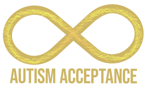
Then I was shown the new symbol for autism, the classic infinity loop shaded in gradient rainbow to suggest inclusivity, integration, acceptance, and the spectrum of autism itself.
Visually it’s much more appealing to me than the puzzle piece, and the reasoning behind its appearance more articulate, inclusive and upbeat. And for me, nostalgia kicked in again—you may remember Apple’s former rainbow-colored apple, right? It dates to 1977. In 1999 it was revised and is now black and white. Former Apple cofounder and CEO Steve Jobs had decided it was time for a change. And so, the rainbow-hued apple went the way of shag carpet and disco.
The loop is novel without being radical, fresh without flash.
Why not update the symbol for autism to the infinity loop? Great strides have been made in understanding and acceptance of autism. There is nothing to put together or take apart. Autism isn’t a jigsaw.
The puzzle piece just doesn’t fit anymore.
Mike Minnis is a guest blogger and client. His books can be purchased on Amazon.

